AllPeople Marketplace
Timeline: 12 weeks
Software used: Adobe Illustrator, Adobe InDesign
AllPeople Marketplace is an online marketplace that makes it easier to purchase socially and environmentally responsible goods with competitive prices, carbon-neutral shipping, and a give-back program greater than any other e-commerce company. I joined AllPeople as a Graphic Design Intern, and eventually rebranded their visual identity.

Background
I joined AllPeople Marketplace as a Graphic Design Marketing Intern in May 2021. At the time, the company had an existing style guide that I worked under, creating several digital assets. By the time my internship ended, the company wanted to overhaul the visual identity of AllPeople Marketplace to match revised brand values and positioning. AllPeople Marketplace selected me to develop a new logo and visual identity for the company.
Problem Statement
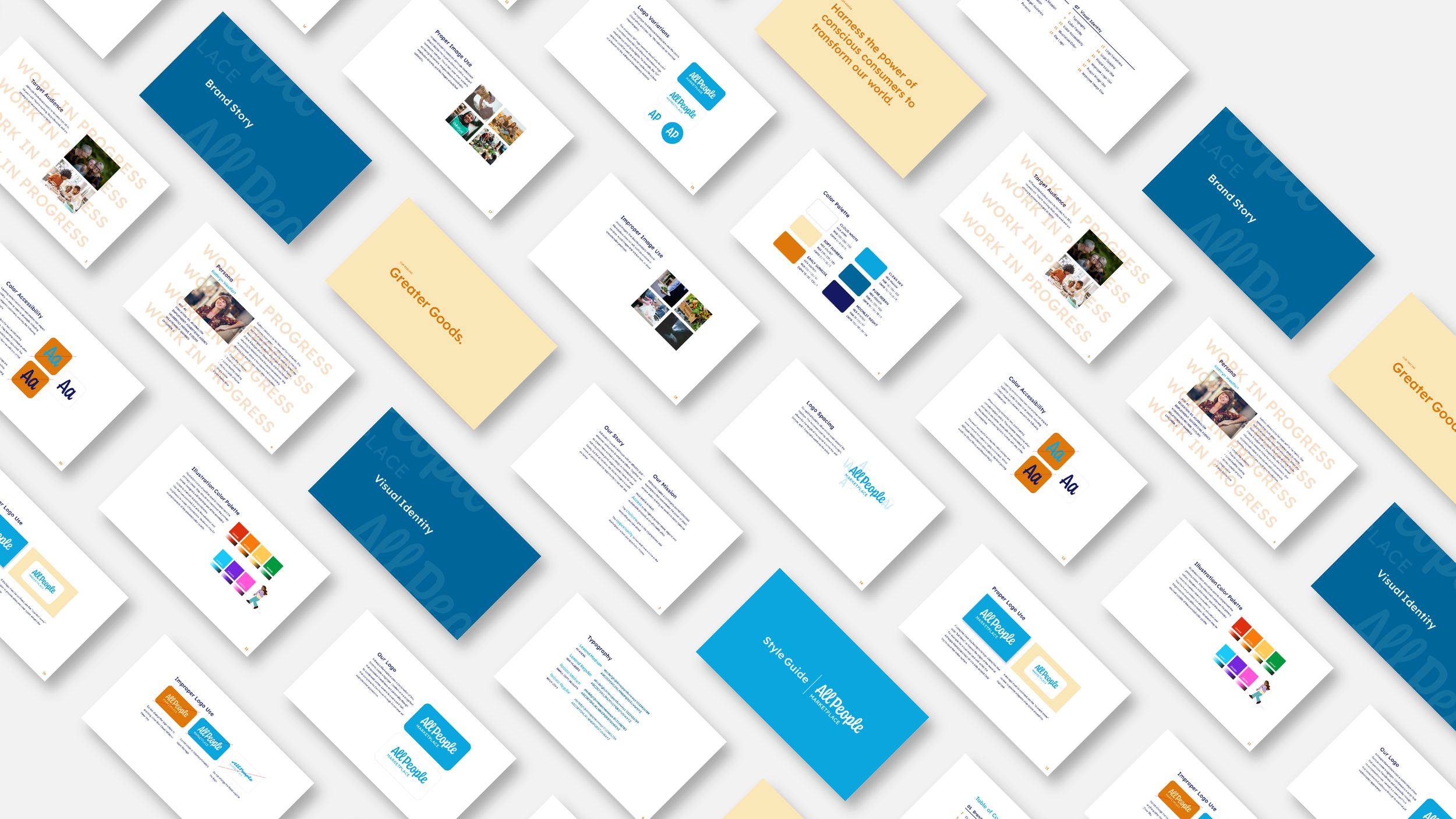
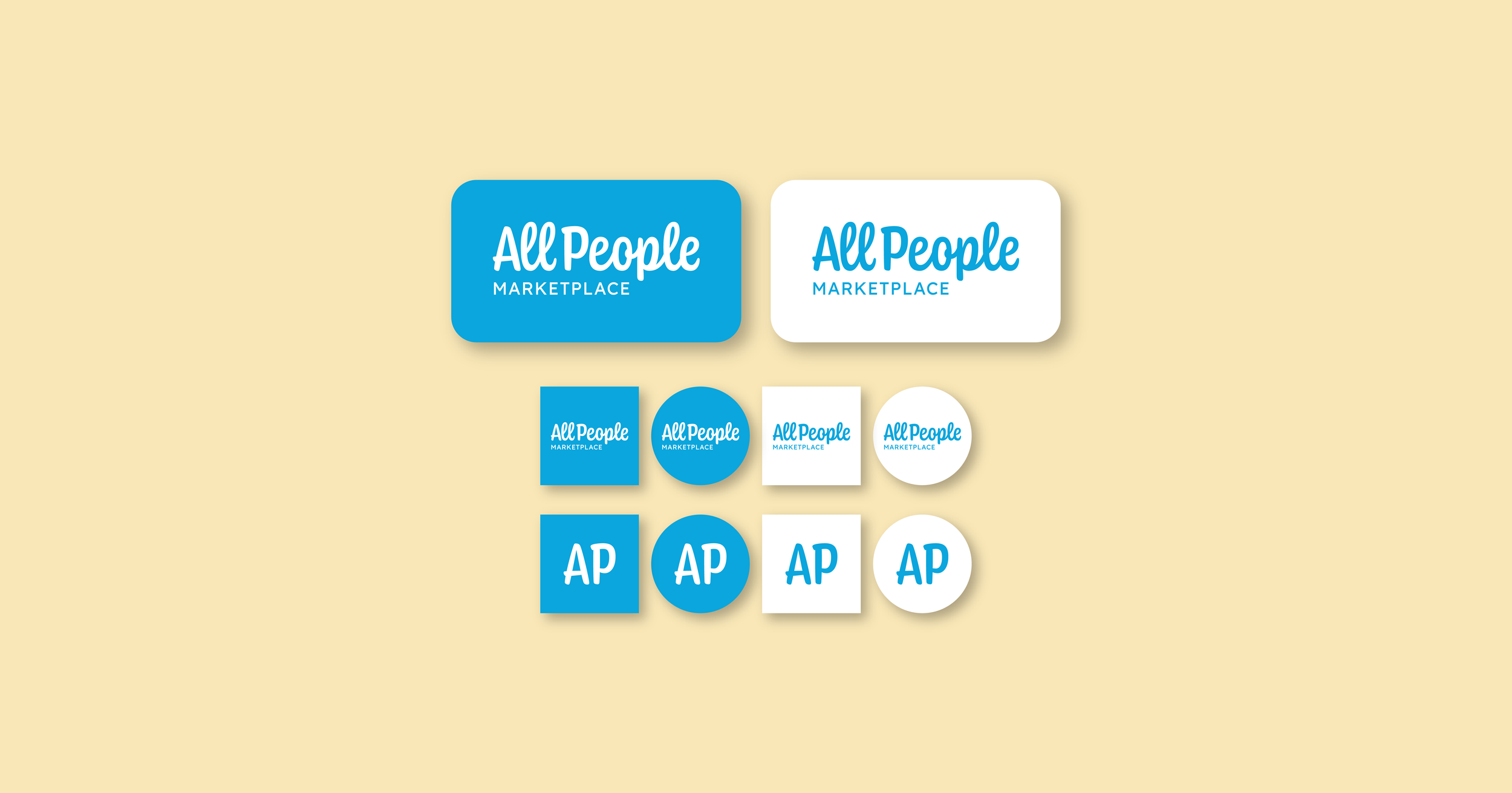
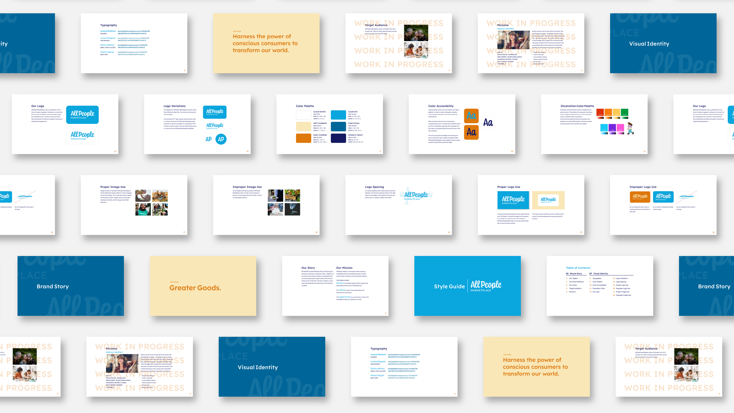
Create a new AllPeople Marketplace logo using the agency work as inspiration, along with the updated brand voice, positioning, and audience. Deliver several logo variations as well as a completed style guide.
Utilize a script font for the logotype
Incorporate a saturated, bright blue
Value Proposition
To harness the collective power of conscious consumers to transform our world, AllPeople provides democratized access to income generation with an online marketplace that sells only planet and people-friendly products made by small businesses across the country for people who care to make big change with their everyday actions.
Audience
Conscious consumers who want to shop ethically and utilize their purchasing power for the greater good.
Ages 35 ~ 55 years old
Middle to upper income
College graduate
Likely female with a family
Process
Wordmark
When I initially met with the client, I was skeptical of their vision. I personally did not gravitate towards cyan for their positioning, and choosing an appropriate script font was going to be a challenge. I wanted something legible and contemporary, not historical in tone. I had to challenge my predispositions.
I started with preliminary font explorations so that the client could understand the varying connotations of scripts fonts. I included mostly script fonts, but I also incorporated some of my own recommendations.
After meeting with the client and giving them my personal recommendations, they agreed to follow my intuition. I began manually altering letterforms, mostly with the intention of simplifying them for better legibility.
At this stage, I began experimenting with the placement of “Marketplace”.
We decided on left-aligning “Marketplace” and tucking it under the descender of the “p”. I then provided several font options for “Marketplace”.
The client chose option 2 with a left alignment, using Coniferous for “AllPeople”, and Lexend for “Marketplace”. We agreed that the shape language of Coniferous made it friendly and approachable, but that we would have to be careful with color choice as to not make the brand feel juvenile.
Color
During our meeting, we discussed what sets AllPeople Marketplace apart from its competitors. As we talked about what makes AllPeople Marketplace unique, especially considering the climate crisis, the client repetitively used sky-related metaphors (i.e. “sunny day”, “breath of fresh air”, “clouds parting”). That’s when it struck me to incorporate the blue the client requested through natural phenomena.
I provided several options, some closer to what the client requested, and some further. Some color palettes were direct references to a perfect sunny day, while others represented a sunrise or sunset.
Visual Identity
The final color palette for AllPeople Marketplace calls upon an optimistic, utopian world in which our planet is healed of climate crises. Its shade names draw inspiration from a healthy environment. The colors themselves are very saturated – one could call them unpolluted as well. These colors communicate to the audience that, through their shopping choices, they are committing to a trajectory where their world could also be free from contaminants.
AllPeople Marketplace uses Lexend Medium and Lexend Regular for headers and subheaders. This rounded, sans-serif font has a wider character width than Roboto and feels friendly without being too informal.
Takeaways
A successfully marketed company is composed of varied approaches – visuals are one piece of a larger puzzle. As a Graphic Design Marketing Intern, I saw marketing through a new lens when working with team members experienced in public relations and copywriting.
When redesigning the visual identity of AllPeople Marketplace, I practiced working within client constraints. Incorporating client-specific requests complexifies the design process, which challenged me to think differently than I might have had I been able to move forward with my typical approach.


