Student Affairs Marketing and Communications (SAMC)
Software used: Adobe Suite, Google Workspace
Senior Brand Manager: Jennifer Vaughn
Design Team: Michelle Hong, Chloe Thepenier, Darren Wong, Adrienne Lee, Selina Li, Lauren Outhabong
Student Affairs Marking and Communications (SAMC) offers strategic solutions that enhance students' experience at UC Davis by making it easier for them to find and understand available resources. As a Student Graphic Designer, my role was to develop digital and print assets to help SAMC achieve this goal.

Graphic Elements
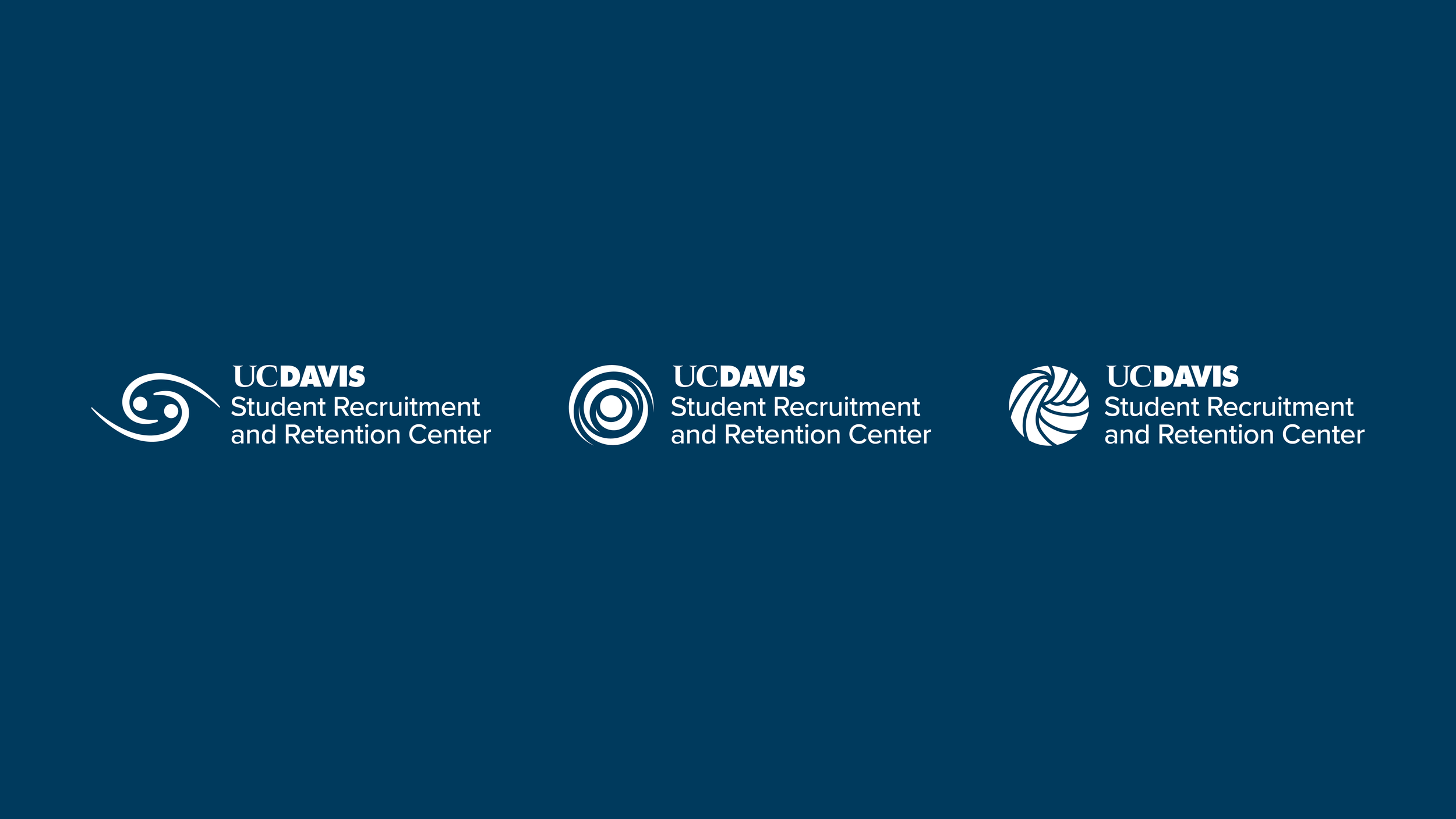
Subdivisions of Student Affairs that serve cultural or identity-based communities use graphic elements that accompany their wordmarks. Over several months, SAMC and the center collaborate to create a visual icon. SAMC is currently in the process of re-designing the graphic elements for all units of Student Affairs, and the existing redesigned elements are shown below.
Student Resource and Retention Center
The Student Resource and Retention Center (SRRC) is a division of Student Affairs that stands for educational equity. Founded by students, the SRRC runs several programs for students that encourage holistic, academic, and personal development.
Background
The Student Resource and Retention Center presented several concepts they wished to see reflected in their logo.
Organic shapes
Self AND Community
“Kapwa": I see you in me and I hope you see me in you. Filipino origins.
We find ourselves by serving our community
“good vibes" " harmony" "warmth"
head, heart, hand
Audience
Approximately 35,000+ UC Davis students, plus alumni, faculty, and parents.
Objectives
Design a graphic element that is emblematic of the Student Resource and Retention Center.
Must accurately follow the client brief described above
Must match the visual language of existing Student Affairs graphic elements
Must use the UC Davis color palette as directed by the Student Affairs Brand Guide
Process
Sketches
When familiarizing myself with the client and their requests, I kept coming back to circular shapes, or spirals that converged at one point in the center. I liked the idea of something that was continuous, representing that the self can rely on the community and then support others in the group with that vulnerability.
Digital Iterations
After sketching, I took several sketches and began drawing them in illustrator. Some sketches translated better than others. I realized that some of my designs only included one concept, and I felt that stronger designs layered multiple ideas into one element.
After meeting with the design team, I refined three specific concepts.
Concept #1: “Kapwa” I see you in me and I hope you see me in you. Graphic element resembles an eye, but looks like two people hugging from above.
Concept #2: Hands, representing the “head, heart, & hands” the client had requested, supporting one another. Keeping one another warm.
Concept #3: Concentric rings, meant to allude to multiple figures hugging. Meant to look like an eye for “Kapwa”, and also meant to look like a galaxy, implying a larger community.
Final Proposal
Other Deliverables
Takeaways
Student Affairs Marketing and Communications
Through SAMC, I've gained insight into what it’s like to work as an in-house graphic designer.
From working on graphic elements, I’ve developed an understanding of client relations throughout the entire design process. I’ve improved my ability to explain concepts to clients who are not well-versed in graphic design.
I’ve worked on a variety of different assets such as motion graphics, social media templates, and even coffee cup sleeves. I’ve diversified my skillset and improved my ability to adjust my design thinking to each form of media I work with.


